Welcome to GeoLift by Recast! This quick start guide will teach you how to operate both the Design and Analyze features in our platform using sample data.
If you haven’t already, you can sign up for 6-months of free GeoLift by Recast usage here.
Once you’ve created your account, please start by downloading both files of sample data in this folder.
“PreTest-Sample Data.csv” is a collection of historical data sorted by date and location and will be used when designing your experiment.
“PostTest-Sample Data.csv” is a collection of data that will be used when analyzing your experiment. When you’re running your own experiments, it should cover the same pre-test period, but extend through the end of your test’s cooldown period.
We’re going to work backwards, first walking you through how to analyze your experiment once it’s complete, and then we’ll show you how to actually design your experiment.
Analyzing an Experiment
When analyzing your experiment, GeoLift by Recast compares the actual performance in your test geographies against what would have happened without the spend change, quantifying the incremental impact and calculating key metrics like ROI or CPA.
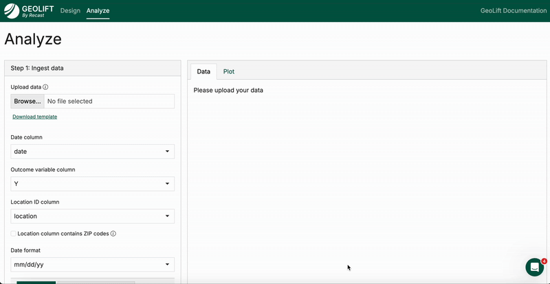
To begin analyzing existing experiment data, head over to the Analyze Tab in GeoLift by Recast. From there, do the following:
-
Upload <PostTest-SampleData.csv> where
it says “upload data” -
Select the outcome variable column as “Revenue”
-
Ensure the Date Format is set at yyyy-mm-dd
-
Then click “ingest data”
You should now see plots of revenue by geography to verify that the data were ingested properly. From here, scroll down to the configure analysis section:
-
Select start date of 03-01-24
-
Select end date of 03-22-24
-
Select cooldown period lasting until 04-04-24
We ran this experiment in Austin, Boston, and Denver, so select those cities for analysis.
Then, continue configuring your analysis:
-
Set outcome variable type to “Revenue”
-
Select increased spend in these locations
-
Input increased spend as $15,000
Then, click the analyze experiment button. This will populate experimental results!
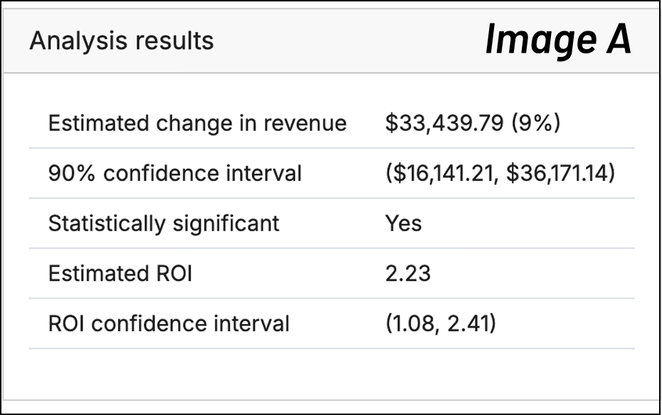
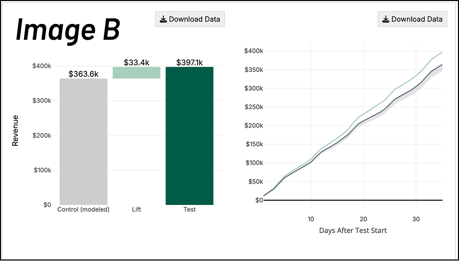
In the top pane there is a table and three charts.
The table (Image A) shows estimated lift from the test in terms of dollars as well as ROI, uncertainty intervals for each, and whether or not the result was statistically significant.
The first plot of Image B (below) shows the modeled “control” geography revenue (grey), the lift from the experiment (light green) and the actual observed revenue in the test geographies (dark green). The second plot in Image B shows how the test evolved over time, showing the cumulative revenue observed between test and control. Here we see the test geographies separating further and further from the control geographies as the test progresses and the benefit of the additional marketing accrues.
The last graph (Image C) shows the revenue by day between test and control group — the left-hand side with the white background shows that prior to the start of the test, the control group matches the test group revenue almost perfectly.
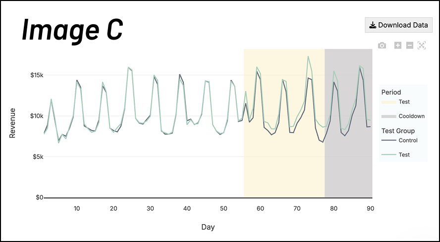
On the right hand side (colored background) we can see how the test group starts to separate from the control group which we infer is due to the marketing intervention.
At the very bottom is the table of control geographies included in the test. GeoLift by Recast uses synthetic controls to improve on traditional matched-market tests. With synthetic controls, the tool essentially creates this weighted mix of geographies that better mimic the treatment regions. Instead of relying on imperfect “pairs” of markets, the algorithm uses pre-experiment data to assign weights so that control and treatment trends line up closely. This produces a more accurate counterfactual and more reliable measurement of lift. For more information about synthetic controls, we recommend this article.
Designing an Experiment
First, ensure that you are on the “Design” tab of GeoLift by Recast. When designing an experiment, you’ll need to upload historical data for the channel you’re measuring. This allows the tool to analyze similarities and differences in geographical performance to select the best geographies to include in your test group. Comparison between geographies with similar historical performance results in more powerful statistical analysis as we can more accurately identify the differences as a result of the spend change.
Your spreadsheet should contain 3 columns: date, spend, and outcome variable. We’ve prepared this data for you, so you can simply follow the steps below:
-
Upload PreTest-SampleData.csv
-
Choose “revenue” as the Outcome variable column
-
Ensure the Date Format is set at yyyy-mm-dd
-
Click “Ingest data”
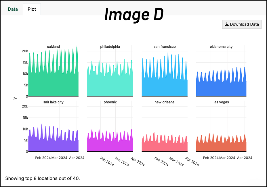
When you upload your data, you’ll see it charted on the right side of the screen similar to Image D. You’ll use this to perform a quick check for any glaring data problems.
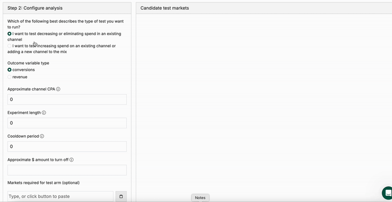
Configure Analysis
The configuration phase is where you tailor the experiment to your specific business context and constraints. By defining parameters like your experiment type, budget, and timeline, you enable GeoLift by Recast to run simulations that identify the optimal test geographies and spending strategy for your unique situation. This flexibility ensures the tool can accommodate different testing goals—whether you're exploring new growth opportunities or validating current spend levels—while maximizing statistical rigor. For the sample data, please use the following configurations:
-
Select the button for “increasing spend”
-
Outcome variable type is “revenue”
-
Approximate channel ROI is 3x
-
Experiment length: 28
-
Cooldown period: 7
-
Approximate $ amount for test: 15000
-
Leave everything else as-is
-
Click “generate test markets”
You will then see a table of candidate test markets with “simulated” hypothetical experiments and their results, including both the simulated lift as well as what a theoretical experiment would have estimated as the lift.
Clicking between different rows in the table will change the graph at the bottom (Image E) which allows us to check the pre-experiment fit–the closer together the black and green lines are, the better the fit. All-else being equal, lower absolute error is better, so you should generally choose one of the top two or three rows of the table.
.png?cb=684180b9a8cf133204355e4879630df9)
Deep dive analysis
In the last section, we just ran one simulated experiment. But what if we just got lucky? In order to confirm that this experiment will be good, we want to run a bunch of simulated experiments with our chosen geography. That’s what a deep dive with these locations will do.
To do this, keep the selected geographies as they are (atlanta, chicago, cleveland, las vegas, phoenix) and click “Deep dive with these locations”.
The output provides a Baseline Confidence Plan and a High Confidence Plan for detecting lift. The Power Curve graph (Image F) tells you the likelihood of detecting a true significant lift at different levels of spend change, and the Simulated Example graphs (Image G) show you what your results might look like if the test had no effect versus if it produced the expected lift.
.png?cb=c55794ad743dd57cd54c5a9aa933f6d7)
You can download the geographies in the test group, and from there, have your channel managers or agency execute the experiment.
Congratulations! You’ve just designed and analyzed your first incrementality experiment using GeoLift by Recast. For more technical information about the tool, you can view our full documentation here. Otherwise, we hope this has prepared you to design and analyze your first incrementality experiment.